
Blog
Making Websites Super!

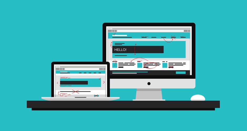
A question I get asked quite a lot by both visitors and customers is “What could you do with my website? Could it be improved in any way?” Well some of them have the potential to be great sites but lack the basic disciplines to really succeed online. Even some of the most creative sites can struggle without proper development or marketing. Websites that have been designed by myself have also been clearly changed by the client at a later stage to the point at where they seem to have lost focus on key elements of their branding.
So here are 10 quick tips to ensure you’re going in the right direction, making your website go from great to super.
Make it fast
If you have a slow site, visitors will be put off. Streamlining the code and optimising images will remedy this. Keeping the styling (style sheet) as an external html page will reduce the time it takes for your website to render a page correctly. Using the jpg format is always the best option to keep images as small as possible, don’t use BMPs or TIFFs. Remember not to upload a picture that has just been taken from your camera – crop it to the specific size you’re after.
Check your browsers
Make sure your site remains consistent across all platforms, and that also includes mobile devices. It may look perfect on Safari and Chrome, but what about IE? Firefox Developer Edition is great at simplifying the process of building a website whether mobile or desktop and was created with productivity in mind.
Don’t be so Flash
Hopefully this year we’ll see a lot less websites using Adobe Flash. They’re not even visible on mobile devices without cumbersome methods to display them. They’re also very buggy, contain lots of security issues and Google just hates them. Even Adobe themselves believe that HTML5 is the future. Best practice – avoid!
Great design equals greater reach
Your website should clearly communicate with your target audience about what you do and why you’re the best choice. If you’re clearly not getting the number of visitors you expected, there’s a possibility the message that’s being conveyed is different from the product or service you’re providing. Don’t be afraid of whitespace on your site, it helps break up the actual page and is just as essential as text or images. Don’t go mad on your colour scheme – simple is always better (KISS – keep it simple, stupid). Always be consistent with your buttons, fonts and icons, don’t go changing the theme halfway down a page – and don’t use badly drawn clipart.
A top tip – listen to your designer, they generally understand about what good looks like!
Make your brand memorable
The logo is one of the most important branding elements for your website. Ideally your logo should be placed top left of your website because this is the primary focus area when a user visits your site. It should be simplistic but bold in its design. If a visitor looks at your logo they should be able to grasp the emotion you want to convey about your business within three seconds.
Take your best shot
Stock images have a time and place. If you want to make your business stand out at a personal level, consider hiring a professional photographer to take those key shots. If your feeling adventurous and you have experience, you may even consider taking them yourself. Just make sure they’re of a high quality (not only in file size but in design).
Capture your visitors
A call-to-action or CTA is a button or link that will drive your potential customers to become leads by filling out a form on a page. It is the transition of moving between a high value message or action (such as – ‘get a free quote’) to the actual page where a visitor completes the form and submits their details. A good CTA should be brief and clear to understand – it should state exactly what the visitor will get if they click on that link. It should also be located in an easy place to find on the page and must be visually compelling using contrasting colours from the website.
Your message is important
When viewing your website, visitors need to be introduced to the core messaging at an early stage. Critical information has to be seen on the screen without scrolling down. Think of it as a folded newspaper – how would an editor grab people’s attention? Top content needs to be above the fold and must also be one of the first elements the user sees on the page.
Get fresh
It’s not only Google that loves fresh content, but your visitors as well. Information gets quickly outdated on the internet, so think about creating news articles or regular blog updates. Just write naturally and without stuffing in lots of keywords, that way you’re less likely to get outranked by your competitors.
Share your content
Social networking websites are excellent tools to enable users to interact between your website and other visitors. Participation in social media helps to maintain contact with your users and understand their preferences or habits. It also enables you to make connections with other professionals of a similar nature. If you add social networking buttons to your website it allows visitors to share the content more easily within their own networks and in turn increase the volume of traffic to your site. Remember, these don’t have to be on just your blog, they could be included on your product page, a news update or a testimonial.